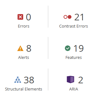
Above is the report from the WAVE Accessibility check. All of the alerts and Contrasts Errors it generated didn’t have to do with any of the previous blog posts that I had made but rather the default settings in the way the opened.ca blog worked like the date links and poor colour contrast from the text and the background which is super interesting for this to point this out since I would have never noticed an issue with this. But I could see for someone that might be visually impaired that the grey text on the white background might be super hard to spot.
My Canva Infographic about Orcas:

List of Design Principles I used and how I used them:
Contrast:
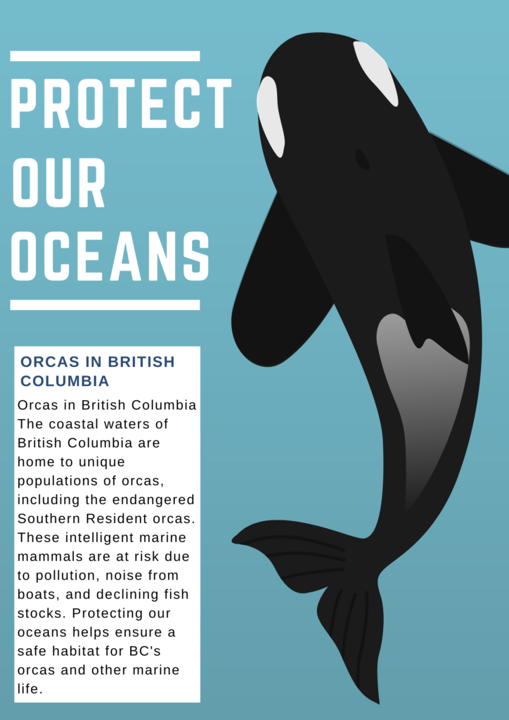
- I used contrast by choosing bold white text against a blue background, making the message “Protect Our Oceans” stand out clearly. The orca’s black and white colours also contrast with the blue background, helping it catch the viewer’s attention.
Alignment:
- I used alignment by organizing the text and graphics to the left side, creating a clean and structured look. Aligning the text and box to the left provides a balanced feel and makes it easy for the viewer to follow the flow of information.
Hierarchy:
- I used hierarchy by making “Protect Our Oceans” the largest text, establishing it as the main message. The smaller font in the information box indicates it as supporting content, guiding the viewer’s attention from the primary message to the details.
Proximity:
- I used proximity by placing the text box near the orca illustration, connecting the information about orcas in British Columbia closely with the image. This layout helps viewers link the visual of the orca with the text information.
Negative Space (White Space):
- I used negative space by leaving open areas around the text and the orca illustration, preventing clutter and enhancing readability. This white space gives each element room to breathe, making the design look clean and organized.
Balance:
- I used balance by placing the orca on the right side of the poster and the text on the left, creating an even distribution of visual weight. This balanced layout makes the design look cohesive and easy on the eyes.
Repetition:
- I used repetition by consistently applying the colour white for the text and lines, which helps unify the design. I also used the same bold, sans-serif font throughout, giving the poster a cohesive look.
Colour:
- I used a limited colour palette of blue, white, and black to keep the design clean and focused. The blue background symbolizes the ocean and complements the orca’s colours, making the poster visually relevant to its theme.
Reflection:
After running the WAVE report and and creating my Canva I realized how grey and non contrasting my website is. I realized I should probably change it to be less grey and white to make it more accessible for all users who would like to browse my blog. I also learned that creating and designing informative posters is rather easy with Canva. Inclusive design to me is something like a sign or poster that anyone could read no matter who you are. Thinking about airports and how they are designed is all about inclusive design. All symbols used are global. bathroom signs, warning signs, even directions are in every language. I think in this modern world that is super important since everyone is so different and comes from all different backgrounds. When designing my Canva I wanted to make it as inclusive as possible by having a massive image of an Orca and very simple text to convey the message. The Orca is so unique nothing else on this planet looks like it and the words “Protect Our Oceans” Is simple and easily translatable. I enjoyed this unit and it made me appreciate the professionalism and principles that go behind infographic design.
Hi Liam! I really enjoyed reading your post! It’s awesome to see how much thought you put into making your blog more accessible. I love the analogy about airports and global symbols that’s such a clear example of inclusive design!
Liam I really like your infographic. I find with a lot of infographics, including some of the canva templates, that all the different text and images can be a bit overwhelming. With your infographic I find that its simplicity makes it that much better and reduces cognitive overload. Your infographic gets the point across and is visually appealing to the eyes. Also, the blank space around the orca is great because it allows the eyes to not be overworked but also resembles the ocean.
Hi Liam,
Excellent design on the Canva infographic. I appreciate you choosing the topic and spreading the awareness about protecting the ocean! The design is very focused and beautiful at the same time!
I am thinking about the your reflection on the WAVE report. I appreciate your perspective taking when you think about accessible. I have weak vision when it’s dark. For example, if I arrive at a movie late, I can’t find my seat unless I turn on my flashlights (which is rude to others I know, that’s why I try not to be late or let my friend to take my hand).
Thus, I can understand why contrasting is very important for a website page. Now I can do perspective taking because you inspired me! Thank you!
Hi Liam, you mentioned how the reports in WAVE helped you identify problems in the blog’s default setting, such as poor color contrast. For example, text on a white background may cause difficulties for visually impaired users. In addition to this, design principles such as contrast, alignment, hierarchy, and balance are listed in the Canvas infographic, and how to apply them in infographics is explained.