Author: liamcalder
Twine Storytelling:
The Lost Baby Orca:
http://www.dromech.com/EDCI337/Baby_Orca
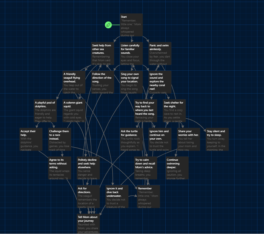
Storytelling Techniques I Recognized in The Lost Baby Orca
Immersing the Audience in the Story:
Vivid Setting Descriptions: The story opens with evocative imagery—”evening swims beneath the shimmering auroras” and the vastness of the ocean. This immerses the reader in the orca’s natural habitat, making them feel part of the underwater world.
Telling a Personal Story:
First-Person Perspective: The narrative focuses on the baby orca’s personal journey, emotions, and thoughts, allowing readers to connect intimately with the protagonist’s experiences.
Creating Suspense:
Uncertain Outcomes: The story presents choices with unknown consequences, such as trusting a giant squid or exploring a coral reef alone. This uncertainty builds suspense and keeps readers engaged.
Bringing Characters to Life:
Distinct Character Personalities: Characters like the wise sea turtle, the friendly dolphins, and the solemn giant squid have unique traits and dialogue, bringing them to life and adding depth to the narrative.
Using Dialogue:
Character Interactions: Conversations between the baby orca and other sea creatures reveal personalities and advance the plot—for example, the sea turtle asking, “Lost, are we?”
Show, Don’t Tell:
Descriptive Language: Instead of stating emotions, the story shows them—”the deep blue stretches endlessly around you, and a sense of loneliness settles in”—allowing readers to feel what the orca feels.
Building to a Satisfying Conclusion:
Multiple Positive Endings: Paths that lead back to the mother provide closure and reinforce themes of wisdom, courage, and the importance of heeding guidance.
Evoking Emotions:
Emotional Journey: The story elicits feelings of fear, hope, relief, and joy as readers navigate the orca’s challenges, fostering empathy and investment in the outcome.
Moral Lessons:
Consequences of Choices: The narrative illustrates the impact of decisions, teaching lessons about trusting instincts, seeking help, and the repercussions of ignoring advice.
Use of Metaphors and Symbolism:
The Ocean as Life’s Journey: The vast ocean represents the challenges and uncertainties of life, while the mother’s guidance symbolizes wisdom and the importance of parental advice.
Interactive Storytelling:
Reader Participation: By allowing readers to make choices, the story engages them actively, making them responsible for the orca’s fate and enhancing the immersive experience.
Repetition for Emphasis:
Reiterating Mother’s Advice: The mother’s teachings are recalled at crucial moments, emphasizing their significance and aiding memory retention of key messages.
Creating Relatable Conflict:
Universal Themes: The fear of being lost and the desire to reunite with family are universal experiences, making the conflict relatable to readers of all ages.
Sensory Details:
Engaging the Senses: Descriptions like “a gentle humming fills the space” and “the coral reef is vibrant, teeming with colorful fish” engage multiple senses, enhancing the vividness of the narrative.
Parallelism:
Mirroring Real-Life Decisions: The choices presented mirror real-life dilemmas, allowing readers to reflect on how they might act in similar situations.
Character Growth:
Learning and Maturation: The baby orca learns from experiences, showing growth and development, which adds depth to the character and story.
Use of Foreshadowing:
Hints at Potential Outcomes: Early mentions of the mother’s advice hint at future challenges and the importance of remembering her words.
My Video Teaching a new FPV Pilot how to Power Loop:
Script and Story Board:
“Today I am going to be teaching you how to do a power loop!”
“First I am going to be teaching you the axis.”
*Show sticks and axis positions and what they do*
*Give the trick warning advisory*
*Then go into showing picking an object that has enough space to do the power loop*
“You want to find an object with enough space above and below to perform you power loop so we are going to select this crane right here since it has the space required.”
*Then demonstrate the power loop while talking about what to do with the your inputs.*
“So first you want to go under the object then pitch back and give a burst of throttle to send yourself up and over the object. When you do this it’s going to then send you in a backwards facing ark”
*Demonstrate the trick again while talking through the power loop.*
*Then show off how to make the trick look nicer and talk about it again and again what inputs to do*
“Those are the fundamentals of the power Loop!”
*Advise that you should practice the basics before learning tricks*
Reflection:
I think the message that The Lost Baby Orca is presenting is important. I remember being little and learning what do do when I was lost or in a perilous position and it it is important for the younger generations to learn what do when faced with the scary situation of being lost. The Lost Baby Orca allows the reader to use their wits and knowledge to navigate from the first person perspective of The Lost Baby Orca to try and find their mom. This story parallels the real life steps of what do like asking a friendly stranger for help or calling out but also teaches the reader to not trust scary strangers or people who could harm you and it warns you for making wrong decisions. I would have loved to have this type of interactive story as a small kid and I think any developing child would benefit from a interactive story based on a very real scary situation like this.
I think definitely if I were to improve greatly on my story telling it would have to do with character development and designing. I’m not a writer but If I feel like if i had more knowledge I could really flesh out my characters to not have such shallow traits and predictability. But for a kids story I think the stereotyping works to get the message across for the story.
With my video too I realized that I suck at sticking to my script so I always like to give rough notes on what I’m going to say. I found when I’m doing presentations or teaching swimming that this is way easier for my brain to read and comprehend on the fly. Since If I write out fully exactly what I want to say I either don’t say it right or I sound like a robot reading line for line which both sounds bad. So for my story board and script I kept it in this format to help me for the filming process.
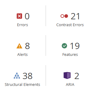
Above is the report from the WAVE Accessibility check. All of the alerts and Contrasts Errors it generated didn’t have to do with any of the previous blog posts that I had made but rather the default settings in the way the opened.ca blog worked like the date links and poor colour contrast from the text and the background which is super interesting for this to point this out since I would have never noticed an issue with this. But I could see for someone that might be visually impaired that the grey text on the white background might be super hard to spot.
My Canva Infographic about Orcas:
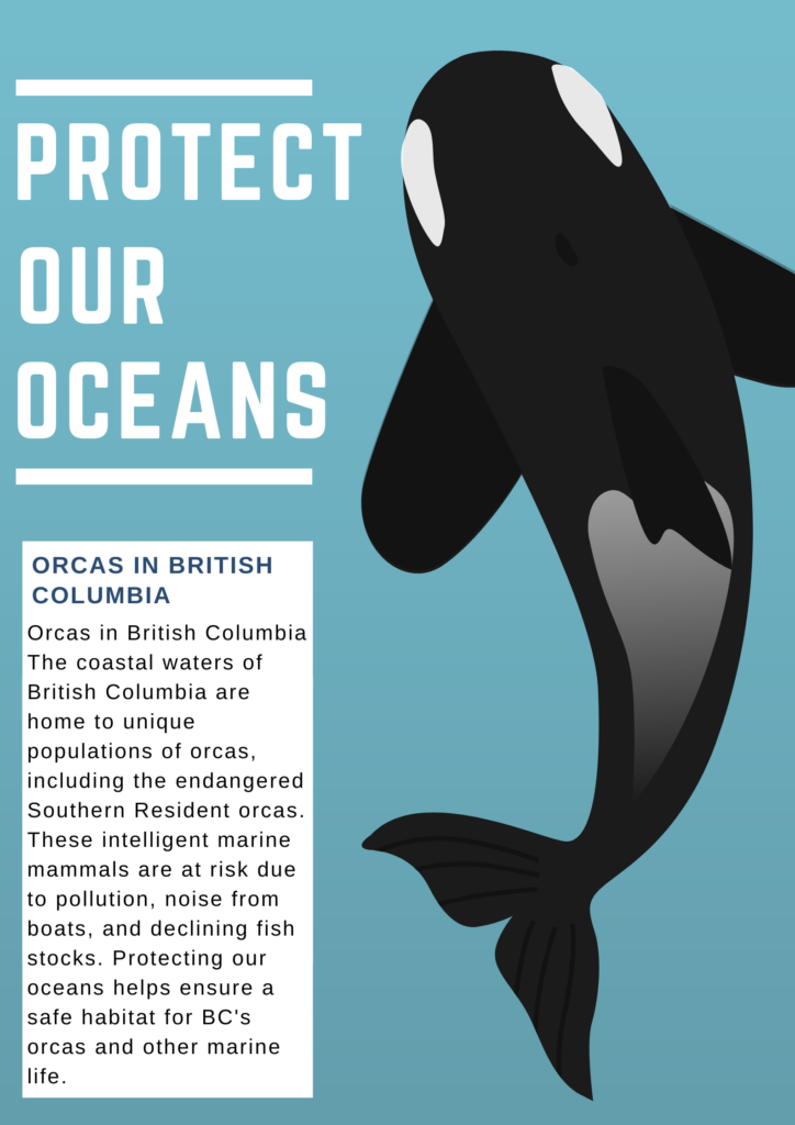
List of Design Principles I used and how I used them:
Contrast:
- I used contrast by choosing bold white text against a blue background, making the message “Protect Our Oceans” stand out clearly. The orca’s black and white colours also contrast with the blue background, helping it catch the viewer’s attention.
Alignment:
- I used alignment by organizing the text and graphics to the left side, creating a clean and structured look. Aligning the text and box to the left provides a balanced feel and makes it easy for the viewer to follow the flow of information.
Hierarchy:
- I used hierarchy by making “Protect Our Oceans” the largest text, establishing it as the main message. The smaller font in the information box indicates it as supporting content, guiding the viewer’s attention from the primary message to the details.
Proximity:
- I used proximity by placing the text box near the orca illustration, connecting the information about orcas in British Columbia closely with the image. This layout helps viewers link the visual of the orca with the text information.
Negative Space (White Space):
- I used negative space by leaving open areas around the text and the orca illustration, preventing clutter and enhancing readability. This white space gives each element room to breathe, making the design look clean and organized.
Balance:
- I used balance by placing the orca on the right side of the poster and the text on the left, creating an even distribution of visual weight. This balanced layout makes the design look cohesive and easy on the eyes.
Repetition:
- I used repetition by consistently applying the colour white for the text and lines, which helps unify the design. I also used the same bold, sans-serif font throughout, giving the poster a cohesive look.
Colour:
- I used a limited colour palette of blue, white, and black to keep the design clean and focused. The blue background symbolizes the ocean and complements the orca’s colours, making the poster visually relevant to its theme.
Reflection:
After running the WAVE report and and creating my Canva I realized how grey and non contrasting my website is. I realized I should probably change it to be less grey and white to make it more accessible for all users who would like to browse my blog. I also learned that creating and designing informative posters is rather easy with Canva. Inclusive design to me is something like a sign or poster that anyone could read no matter who you are. Thinking about airports and how they are designed is all about inclusive design. All symbols used are global. bathroom signs, warning signs, even directions are in every language. I think in this modern world that is super important since everyone is so different and comes from all different backgrounds. When designing my Canva I wanted to make it as inclusive as possible by having a massive image of an Orca and very simple text to convey the message. The Orca is so unique nothing else on this planet looks like it and the words “Protect Our Oceans” Is simple and easily translatable. I enjoyed this unit and it made me appreciate the professionalism and principles that go behind infographic design.
For my big idea I wanted to teach people how to identify some of the most common tricks used in FPV Freestyle.
Below are 3 common tricks you are going to learn to identify:
Trick 1
The Power Loop:
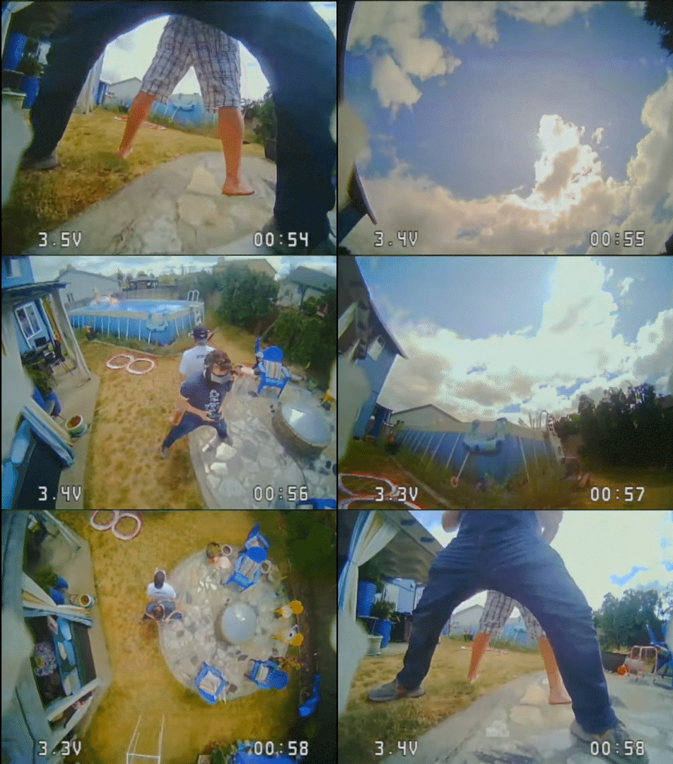
A Power Loop is a circular drone maneuver where the drone pitches back to ascend, flips upside down at the top, and then descends to complete the loop, returning to near its starting altitude.
To spot a Power Loop:
Look for a steep upward pitch followed by an inversion.
The drone traces a continuous circular path.
It ends with the drone leveling out at a similar altitude to where it started.
In this case the drone Power Loops in between the pilots legs.
Trick 2
The Matty Flip:

A Matty Flip is a drone trick where the drone flips forward then flies underneath an obstacle flying backwards.
To spot a Matty Flip:
The drone flips below an object, flies backwards.
It follows an arcing motion beneath the obstacle.
The trick ends when you can see the object in view again.
In this case the drone Matty Flips the cars side view mirrors.
Trick 3
The Trippy Spin:

A Trippy Spin is a drone maneuver where the drone orbits around an object while tilted at a steep angle, continuously spinning as it circles the target
To spot a Trippy Spin:
The drone stays pointed toward the object at a sharp tilt with the object at the top of the screen.
It maintains a tight, circular path around the object while spinning.
The drone’s orientation remains locked on the object throughout the maneuver.
In this case the drone performs a trippy spin on this tree.
Now after you’ve studied these tricks and are confident you can identify them it is time to watch a Freestyle FPV video by tinexd FPV and your job is to identify some of the tricks in this interactive video
Did you identify all identify all the tricks correctly?
Trick GIFs sourced from: https://prowhooper.com
The Overview plan from this lesson:
Big Idea: Teach a learner how to identify some common FPV Freestyle Tricks
Learning Outcomes: Be able to successfully identify taught tricks in a real video
Evidence of learning: Get a close to high score in the videos quiz
Assessments: The grade of the video quiz assess their new knowledge
Learning Activities: Watch provided gifs and read descriptions to practice trick identification
Reflection:
For this blog post I actually loved learning to use and using H5P. This is such a great tool and I could see it being so useful in all aspects of online learning. I really liked how simple it was to put my quiz on top of the video and I really appreciated all it’s tools. I tried to use the concepts scaffolding when designing this learning experience by having each trick having GIF to watch and a description as guidance as to break down each trick so it was fundamentally understandable. Then the quiz was also was to then go right into independence and practicing the newly acquired knowledge. I think the once aspect I missed was gradually reducing independence but this could be achieved maybe with more interactive videos. Overall though I thought this module was really fun. I love educating people on things I’m passionate about and this module enabled exactly that.
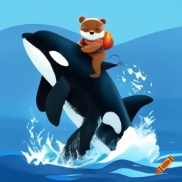
Craiyon. A Bear Riding an Orca. Craiyon.com, 9 Oct. 2024.
The SAMR generated by ChatGPT:
SAMR Analysis of Craiyon (Generative AI Tool for Learning)
Substitution:
At the substitution level, Craiyon can be used to replace traditional image-creation tools such as hand-drawn illustrations or online image searches. Instead of asking students to search for or create images manually, the tool generates visuals from text prompts. The learning task itself doesn’t change but becomes more efficient.
Example: A student could use Craiyon to generate an image of a historical event instead of manually drawing or finding one online.
Augmentation:
At this stage, Craiyon enhances the process by adding functionalities that go beyond what manual tools offer. For instance, the ability to generate a wide variety of images in real-time provides instant feedback, enhancing creativity and flexibility in learning. Students can iterate quickly and explore different visual possibilities with ease.
Example: A student could input different descriptions of a character from a book and receive various visual interpretations, helping them think critically about the text.
Modification:
Generative AI tools like Craiyon start transforming the task at the modification level. Here, students can modify their creative process, using AI not only to generate images but also to experiment with visual storytelling. The tool allows students to prototype, compare, and contrast visual designs in ways that were previously impractical.
Example: In an art class, students can experiment with different artistic styles for their projects by generating several iterations of a concept through AI. This supports deeper engagement with concepts like symbolism or theme.
Redefinition:
At the redefinition level, the use of Craiyon can enable completely new tasks that were previously inconceivable. Generative AI allows students to engage in collaborative storytelling where text and visuals are continuously generated and iterated upon by both humans and AI. It also promotes the exploration of creativity and problem-solving at a scale and speed that weren’t possible before.
Example: Students could work together to design an entire visual world using Craiyon, incorporating real-time feedback from the AI. This task integrates art, design, creative writing, and collaboration in an entirely new form of learning.
My Reflection:
I think one of the most fascinating things about AI image generation and I have tinkered with a few but never Craiyon is that the LLM uses it’s knowledge of what something should look like based on it’s knowledge but it doesn’t know what is right and is wrong once it has generated it’s image. So the image itself is the hardest information for it to understand.
When I prompted ChatGPT again to analyze what was in the above image this was it’s response:
The image appears to depict an animated or stylized scene of a bear riding an orca (killer whale). The bear is sitting atop the orca as it jumps out of the water, and the bear seems to be holding something, possibly a small backpack or an object on its back. The water is splashing around them, and there’s a small orange crayon floating in the water, likely a reference to the Craiyon AI tool.
This scene seems playful and whimsical, combining elements of both wildlife and fantasy.
ChatGPT. “Description of Image: Bear Riding an Orca.” OpenAI, 9 Oct. 2024.
So as you can see ChatGPT completely missed that the Orca has 2 sets of fins and an extra dorsal fin because it can’t tell what a correct orca should look like only that it looks like an Orca.
So my Ethical concern with AI art as that itself is a feedback loop. The more AI art that is generated that is wrong. The more art out there that is wrong it uses to create more wrong AI art. Therefore it will eventually poison the sample supply to far beyond repair If AI art continues to spread across the globe.
But as of right now I think AI art is a great tool for learning. It is not always super correct but I have used it myself to generate art for slideshow projects because it is a great way to produce art for abstract thoughts in the moment. Like If I wanted to create a slideshow about orcas and bears it would be hard to find an image online that has both in them that does not have copyright laws protecting them.
That being said there is a grey area of AI art sometimes sampling copyright protected images but I imagine that will be sorted soon in the future by lawyers.
I think that in 2-3 years time AI art will either be so good it replaces artists or so bad it creates the negative feedback loop I mentioned and becomes really terrible. But only time will tell. Right now If you want to test my theory on the feedback loop google anything abstract like “Bear licking ice cream” or “Cat in car” and at least ONE of the top 5 results will be AI Art (It’s sometimes all of them). It’s like a plague on the internet but at the same time a gift.
My Screencast was called: Building a FPV Freestyle Drone – The Basics
This was my first screen cast I have ever created. I found it challenging to try and balance all the multi media inputs all at the same time like the voice over and the visual demonstration. I have a background in teaching swimming and I have been doing that now for almost 7 years so I am familiar with some of the core concepts of teaching. My usual strategy when it came to teaching a skill when swimming was step by step. It went: Say, Show, Explain, Practice. But with creating a screencast you have can do the say and show at the same time very comfortably which took some getting used to. I noticed though that when learning about screen casting I had already understood the concepts of pretraining and segmenting since these are very useful tactics when teaching any stroke at any swimming level.
When creating this screen cast about the basics of FPV Freestyle drone building I tried to employ the concepts of segmenting, pretraining, and modality mostly since these concepts I was most familiar with using in my teaching experience and watching other screencasts online but what surprised me the most as a very effective tool was signaling. I found that adding text to supplement the facts I was presenting was a rather useful thing. By adding it with my narration and visuals it served to drive home important but related facts that help you stay focused and understand the concept I was speaking on. Like when speaking on what KV is I added text saying how KV relates to the power and size of the motor which if this knowledge was just added as narration It would have made the narration drag on.
When designing my screen cast I imagined the audience as a person who is somewhat already interested in FPV freestyle drones but doesn’t know where to start when they are deciding what parts to order. I wanted the audience to understand the difference in drone frames and the purposes they serve by being different and how these differences relate to the batteries and motors you can select after deciding your frame. This was something I had to do a lot of research on when I built my first drone so I wanted to make a bit size screencast that if I had when I was first learning could have greatly benefitted from.
Overall I enjoyed learning how to screencast and I feel I could improve so much more with practice. Learning how these learning principles from this module work together to optimize learning by managing cognitive load and enhancing how learners process multimedia content was super interesting. A lot of the concepts I knew already from my teaching experience but learning how to apply them to multimedia learning was an interesting experience. I would definitely say that in general I’m more comfortable teaching person to person face to face as of right now.
What is your preferred mode of remote communication?
I prefer email and discord. But any direct messaging service I can use.
What are your communication strengths?
I have tons of experience working in the publics eye so I am good at staying formal but fun and engaging when teaching or in conversation.
What are your communication weaknesses? Where would you like to grow?
I would like to communicate better online. I think this is a good skill in the modern world to learn how to communicate effectively online. So much emotion can be lost when speaking trough a screen.
Do you consider yourself an introvert or extrovert?
I would say I’m in between. I have a social battery for sure but I think it’s larger than most. I like being out and meeting people one day and cozy the next.
What time zone are you in?
PST.
What time of day do you prefer doing academic work?
Mid day usually.
When you are upset do you tend to share this with others or keep it to yourself?
I tend to share with the people close to me.
What do you like about group work?
Meeting people and being able to coordinate tasks tailored to peoples strengths. I like efficiency.
What don’t you like about group work?
It can be unreliable sometimes.
What else would you like your team to know?
I may be away most weekends so I would love to do most of our communication during the week days.
Recent Comments